Final well on the way homepage design
Project Overview
For my first UX project I chose a prompt to design a 'specialized mobile app for a food truck'. So I created a brand for "well, on the way" a food truck that has healthy food options that they can pre-order healthy and save time waiting in line.
My Contributions
Seeing as this was my first project for the Coursera UX certificate program, I took on all the roles in the UX process including the user research, sketching, wire framing, design and prototyping. I began this project in September of 2022.
User Research
We asked a select group of users who order food out a few times a month, what might be useful when ordering on-the-go. We asked people school-aged to retirees and busy parents. We found there to be a hole in the market for food trucks that have offer healthy food options, that you can order on-the-go. So we then conducted a competitive audit of other companies, with storefronts, that offer healthy food options, and also some companies that have food trucks that you can order from. After this research we found that a food truck that serves healthy food that can be pre-ordered would be our value proposition.
Convenience
Quickly locating a place to get food on-the-go.
Healthy Options
Finding FAST but ALSO healthy food options that are convenient.
Nutrition Info
Most health-conscious people want to view nutritional information of the food they eat and at the very least they want to know the ingredients and to be able to modify them.

User Persona

User Journey Map
Ideation and wireframing
Paper wireframes using Crazy Eights exercise
My first digital wireframes! I wanted the homepage to immediately provide information on the location or the food truck and easy access to start an order. And I wanted a menu that was easy to flow through, but gave as many details as possible about the menu item before having to click for more details.
And from the start I wanted there to be a way to filter menu items by diet type.
The home screen was the most difficult to design. I wanted it to be visually appealing but also provide enough information for them to quickly begin the user flow (placing an order) without having to think too much, by clicking on an item in the carousel.
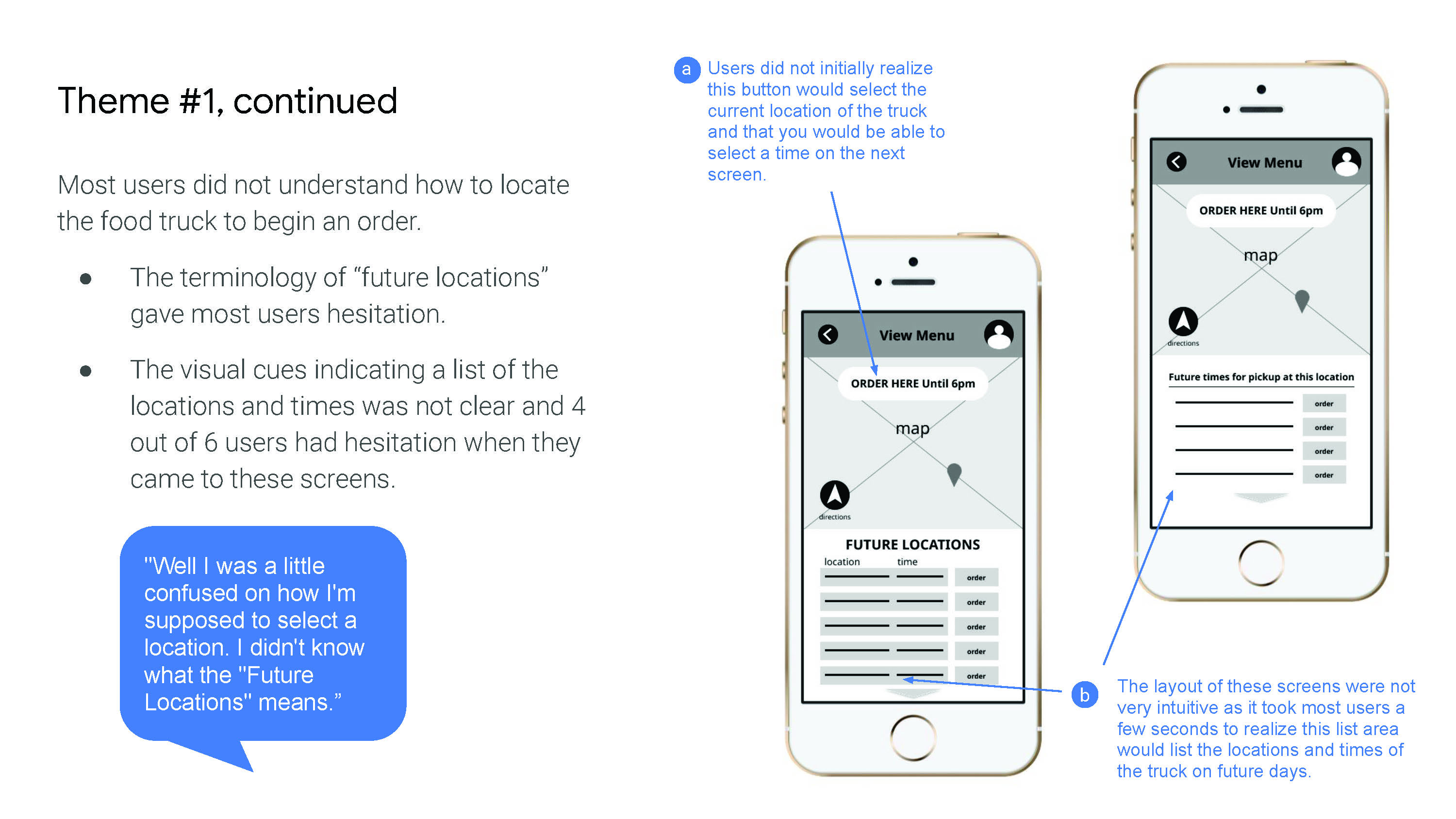
And I wanted users to be able to quickly locate the food truck upon opening the app, so we added a map and locate button to the home screen.
I wanted users to be able to quickly find the truck or a future stop.
This screen would show users the location and allow them to select a time. The directions button would allow them to get directions to the food truck.
I really wanted users to be able to quickly identify the foods that fall within their dietary limitations or preferences.So this ‘filtered menu’ screen only shows menu items that the user wants to see.
I really wanted users to be able to quickly identify the foods that fall within their dietary limitations or preferences.So this ‘filtered menu’ screen only shows menu items that the user wants to see.
Prototyping and Usability Studies

Low-fi protoype flow
Well on the Way Lo-fi Prototype.
The low-fidelity prototype allowed users to find the truck, filter menu items, and place an order. They were also able to view the cart and complete payment. This prototype was used for my first usability study.
Low-fi Prototype
Round 1 Findings
- Locating the food truck was not intuitive.
- The filter feature is valuable, but not clear on how to do it.
- Adding menu items and checking out is intuitive. Favoriting is valuable.
Round 2 Findings
- The “filter” button is confusing.
- The stars and map on the homepage can be confusing
- Need to be able to edit quantity and delete from cart.
Mock-ups, Iterating on Designs and Finalizing the high-fidelity prototype

Mock-ups

Mock-ups

Mock-ups

Accessibility considerations

Final prototype
Check out the next project
Next